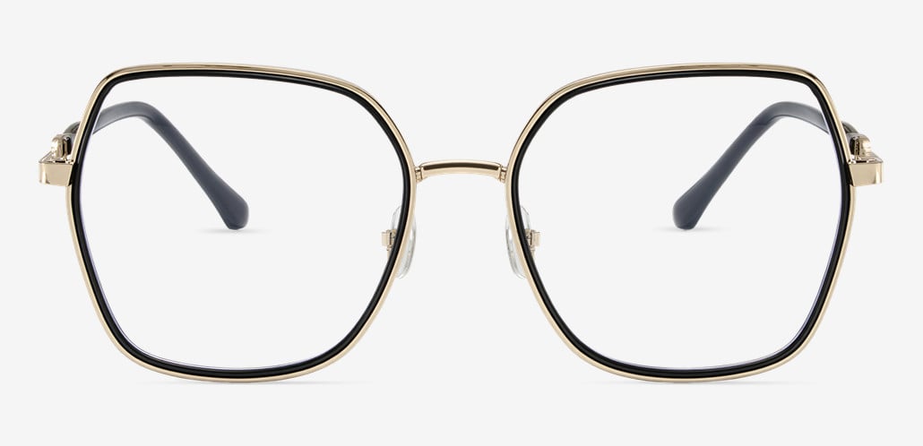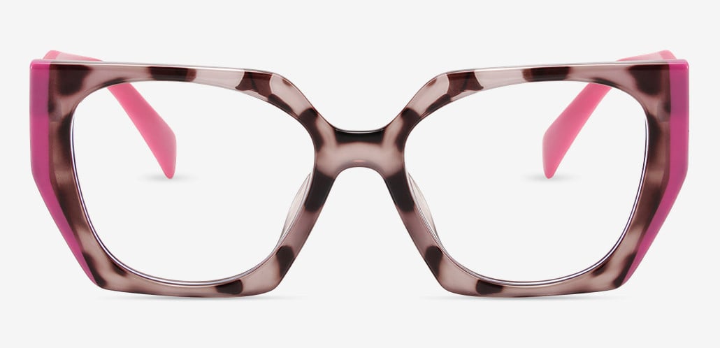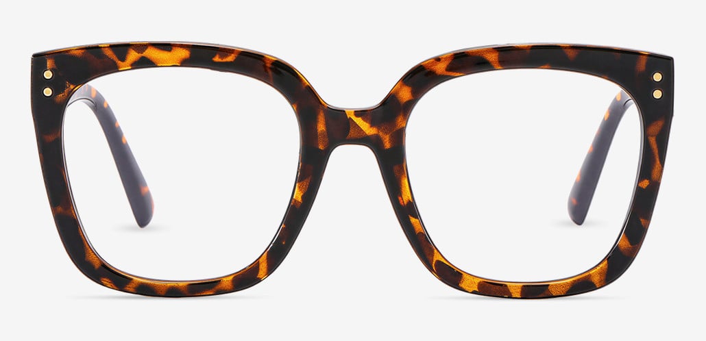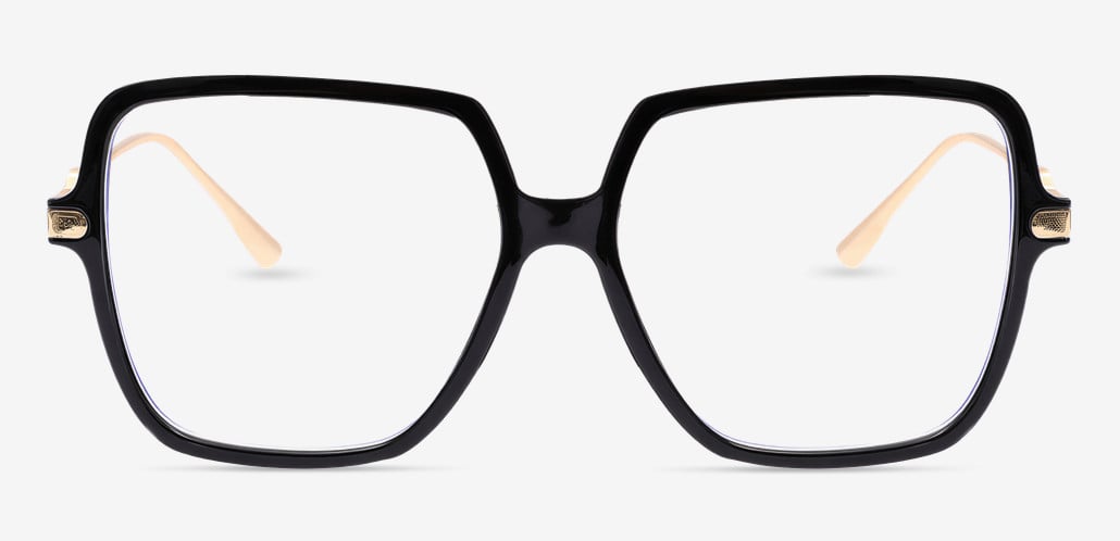

Most guides on this topic open with frame shapes. That's the wrong end of the problem.
Progressive readers are a spec purchase wearing the costume of a style purchase. Whether a pair works for you is settled by four measurements, and only one of them — the add power — is printed anywhere on the box. The other three are things you have to work out yourself, and they're the reason two people can buy the same +2.00 no-line readers and have completely different experiences with them.
This walks through all four, in the order they constrain each other, plus a short test protocol for telling "I need to adapt to these" apart from "these are wrong and I should send them back."
Before anything else: are progressive readers even the right product?
Over-the-counter readers are built on three assumptions about your eyes. Both eyes need roughly the same amount of help. Neither has meaningful astigmatism. Your distance vision is fine without correction.
When those assumptions hold, a well-chosen pair of progressive readers performs close to a prescription pair for a fraction of the cost. When they don't hold, careful frame selection won't rescue the purchase. Five situations where you should stop here:
You already wear glasses or contacts for distance. There is no version of an OTC reader that also corrects your distance vision. What you want is prescription progressive glasses — same lens concept, built from your actual numbers.
One of your eyes is noticeably weaker than the other. OTC readers put identical power in both lenses. If the difference between your eyes is more than about 0.75 dioptres, one eye is permanently a little out of focus, and your visual system spends the day quietly compensating. That shows up as fatigue rather than blur, which makes it hard to diagnose from the inside.
You have astigmatism above roughly 0.75D. Readers contain no cylinder correction. Text will look faintly doubled or shadowed at every power you try, and you'll keep buying stronger pairs chasing a sharpness that isn't available.
Your main task is a desktop monitor at 24 to 28 inches. This one surprises people. A progressive reader is engineered with the full add at the very bottom of the lens and the intermediate zone through the middle. That's ideal if you move between a phone and a laptop. It's a poor fit if you stare at a single monitor for six hours, because you'll be holding your chin up to keep the screen in the right band of the lens. What you want there is an office or degressive lens, which is built the other way around.
Your near vision changed suddenly, or you've never had an eye exam. Presbyopia arrives gradually, over years. A change you noticed in a matter of weeks is worth having looked at by an eye care provider before you solve it with glasses off a shelf.
None of that applies? Good. On to the numbers.
Number 1: Your actual working distances
The industry standard advice is an age chart — 45 gets +1.25, 55 gets +2.00, and so on. Age charts are built by taking the average remaining focusing ability for a population and pairing it with an assumed reading distance of 40cm. Your arms are not average. Neither is your posture, your screen size, or how close you hold your phone in bed versus at a desk.
So measure instead. It takes ninety seconds and it's the single most useful thing you can do before buying progressive readers.
Sit the way you actually sit when you work or read. Have someone hold a tape measure from the bridge of your nose, or hold it there yourself, and note three distances:
Where you hold a phone or a book. Commonly 12 to 18 inches, but the spread is wide.
Where your laptop screen sits. Usually 20 to 26 inches.
Where a desktop monitor or the TV sits. Past 26 inches.
The arithmetic behind this: the total focusing power required to see clearly at a given distance is 1 divided by that distance in metres. Forty centimetres needs 2.50 dioptres. Thirty-three centimetres needs 3.00. Your own eyes still supply part of that total — the add power only covers the shortfall — which is why your add is never simply the reciprocal of your reading distance. But the distance sets the ceiling, and if you don't know it, everything downstream is a guess.
Two things usually come out of this exercise. People who assumed they read at 16 inches often turn out to read at 12. And the gap between the phone number and the laptop number is usually larger than expected, which is precisely the gap progressive readers exist to close.

Number 2: The add power — and why you shouldn't round up
There are two dependable ways to land on a power without an exam.
If you already own single-power readers that work for printed text, use the same number. Progressive readers are not stronger readers. They carry the same near power with a usable intermediate corridor above it. Switching to a progressive design is not a reason to change strength.
If you're starting from zero, test in ascending order. Try the weakest power that gives you comfortable clarity at your measured reading distance. Not the sharpest — the weakest that's comfortable. Read a full paragraph at each strength rather than glancing at a word, because eye strain from an overpowered lens takes a minute or two to declare itself.
That "weakest comfortable" rule is the opposite of what most people do, and it matters more than almost anything else here. Add power and focal range trade off directly against each other. A +2.50 lens has a narrower band of clear vision than a +1.75, and it sits closer to your face. Buy stronger than you need and your phone has to come to a specific distance, whether or not that's where you like holding it. Overpowered readers are the most common self-inflicted problem in this category, and because stronger genuinely looks sharper for the first ten seconds in a store, people talk themselves into it constantly.
For sanity-checking your own result, not for replacing it: early forties tends to land around +1.00 to +1.25, late forties around +1.50 to +1.75, fifties around +2.00 to +2.25, and sixty-plus around +2.50. If your measured result is two full steps away from your age band, re-measure your working distance before you commit — one of the two numbers is probably off.
One product distinction worth knowing. Two different things get sold under the progressive readers label. The common one is clear on top: zero power in the upper lens, magnification building toward the bottom. That's what most people want. The other is dual focus or top and bottom magnification, designed for people who need to see close-up detail while looking upward — mechanics under a car, someone working on a ceiling fixture. If a listing mentions magnification at the top, it's the second kind, and it will feel wrong for desk work.
Number 3: Lens height and corridor length
This is the physical constraint, and it's where a purchase that looked right on paper falls apart.
A progressive lens changes power gradually down a vertical channel called the corridor. Corridors come in two broad lengths. Short corridor designs complete the power change in roughly 11 to 14mm; standard corridor designs take 15 to 18mm. Inexpensive progressive readers lean heavily on short corridors, because a short corridor fits into more frames. The trade-off is real: a faster power change means the optics distort more sharply at the sides, so the usable reading zone is narrower and the peripheral "swim" is more pronounced.
What the frame has to supply is fitting height — the vertical distance from your pupil's centre down to the bottom inside edge of the lens. A short corridor needs roughly 18mm of that. A standard corridor wants 22mm or more. Since your pupil generally sits somewhat above the vertical midpoint of the lens once the frame is on your face, a total lens height of about 30mm is a practical floor, and 32 to 36mm gives you comfortable room.
People miss this in both directions.
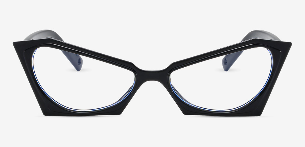
Too shallow. Narrow rectangles, low-profile wire frames, aviators with a deep bottom sweep. The corridor gets clipped before it finishes, so the full reading power is either compressed into a sliver or simply not there. The symptom is tilting your chin up further and further and never quite finding a clear zone.
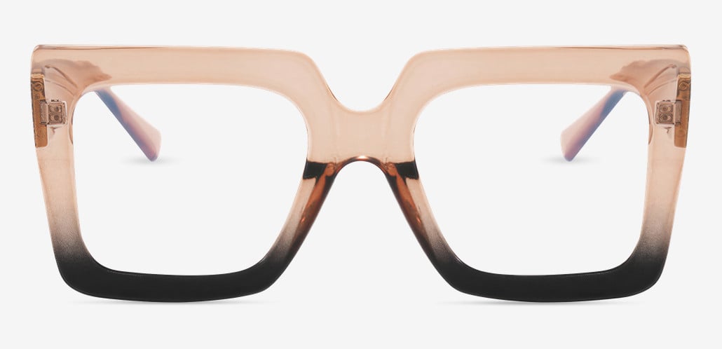
Too tall. Oversized square and boxy frames have plenty of lens height, but they also sit low on the face. The corridor is intact — it's just been dropped below where your eyes naturally travel when you look down. You end up reading through the intermediate portion all day and wondering why nothing is quite sharp.
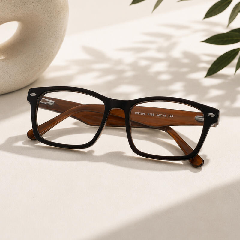
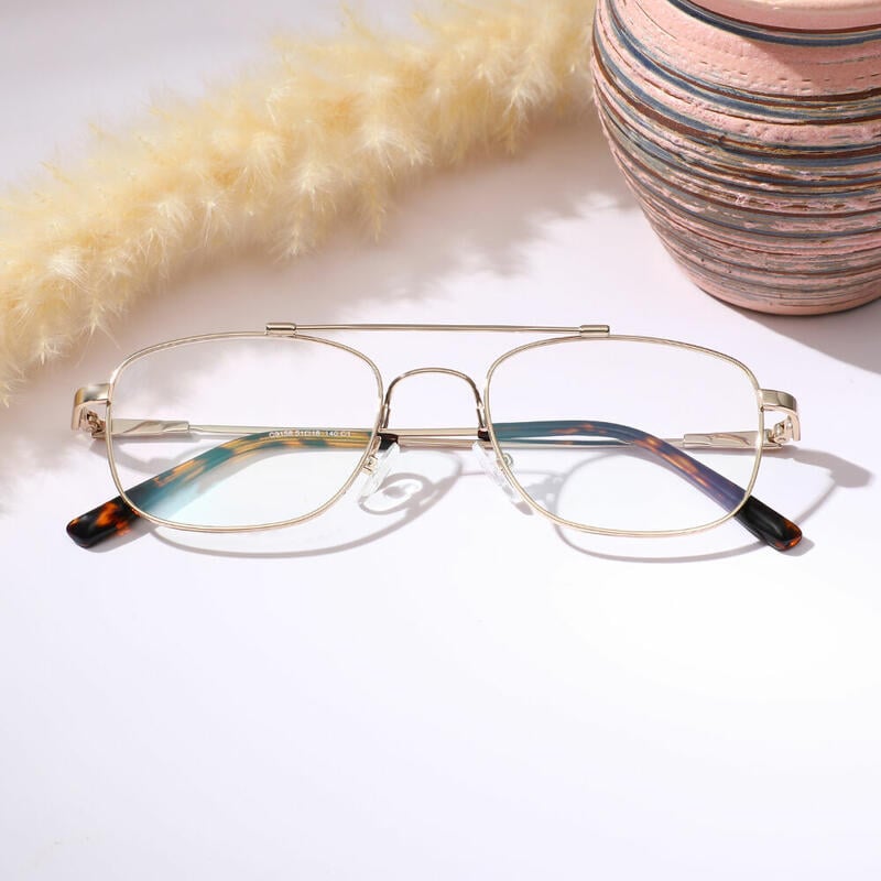
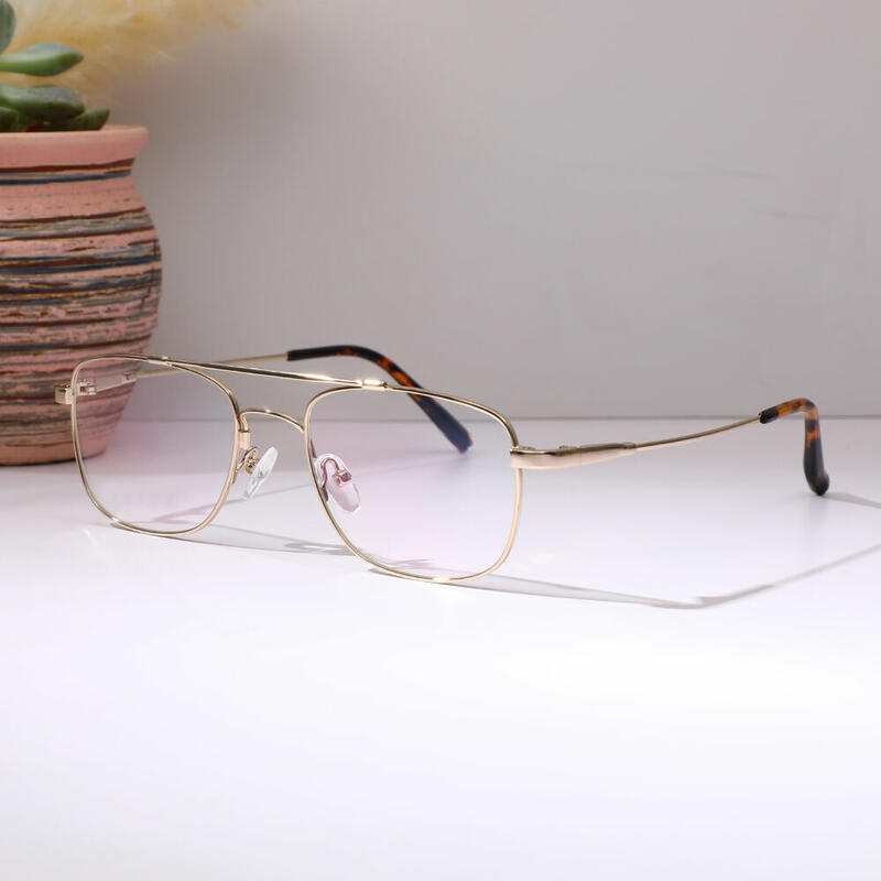
The fix for the second problem is adjustable nose pads, and they're the most underrated feature in this whole category. Raising the pads lifts the frame, which lifts the reading zone relative to your eye; lowering them does the reverse. It gives you a few millimetres of correction after purchase, which is often exactly the margin you need. Fixed acetate bridges offer none of that — what arrives is what you get. For a first pair of progressive readers, a metal or mixed-material frame with pads is the safer bet even if acetate is what you'd choose on looks alone.
One more frame note: skip heavily curved or wrapped frames. Wrap tilts each lens away from the plane it was designed for, which shifts the corridor sideways relative to your pupil. It's fine in sunglasses with no power. It's a problem here.

Number 4: PD — the measurement nobody mentions
Every lens has an optical centre, and it's supposed to sit directly in front of your pupil. Mass-produced readers are made to a single fixed pupillary distance, typically somewhere in the 62 to 64mm range, because they're manufactured for an average face rather than yours.
If your PD is 58, or 70, each lens is horizontally off-centre relative to your eye. In a lens with power, off-centre means induced prism. The relationship is straightforward — prism dioptres equal the decentration in centimetres multiplied by the lens power in dioptres — so 4mm of error in a +2.00 lens produces 0.8 prism dioptres per eye, and the two eyes' errors add together rather than cancelling.
What that feels like is the important part, because it doesn't feel like blur. It feels like a faint pulling sensation, or fatigue that arrives twenty minutes into a task, or an ache behind the eyes with the text still perfectly sharp. Almost nobody connects those symptoms to PD. What they do instead is assume the power is wrong and order a different strength, which changes nothing, and then conclude that progressive readers don't work for them.
There's a second layer: your near PD is about 3 to 4mm narrower than your distance PD, because your eyes converge inward for close work. Properly built progressive readers account for this by insetting the corridor slightly toward the nose. Cheap ones don't.
To find your number, check any glasses prescription from the last few years — it's usually written there. Failing that, you can measure it well enough at a mirror. Hold a millimetre ruler flat against your brow. Close your right eye, and line the zero mark up with the centre of your left pupil. Keeping the ruler still and looking straight ahead, open your right eye and close your left, then read the number sitting over the centre of your right pupil. Do it three times and take the middle result. Accuracy within a millimetre is plenty.
Then buy somewhere that treats PD as an input rather than an assumption. Aoolia builds its progressive readers on the same lens equipment used for prescription work, which means your PD is entered and the optical centres are cut to it — the reason a $6.95 frame here isn't optically the same object as a $6.95 frame from a rack.
Only now, the frame
With the four numbers settled, frame selection becomes a filtering problem rather than a gamble. Work down in this order:
Lens height 30mm or greater. Non-negotiable. This eliminates most of the catalogue in one move, which is a feature — it means everything left is physically capable of holding the lens.
Adjustable nose pads, if this is your first pair.
Weight and material. Progressive readers get worn for long stretches, unlike single-power readers that go on and off. Titanium and TR90 stay comfortable over hours in a way that heavy acetate doesn't.
Fit width. A frame that's too wide slides down your nose, which drops the reading zone. Check the total frame width against a pair you already own rather than guessing from a photo.
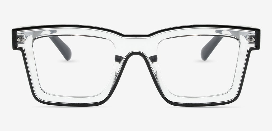
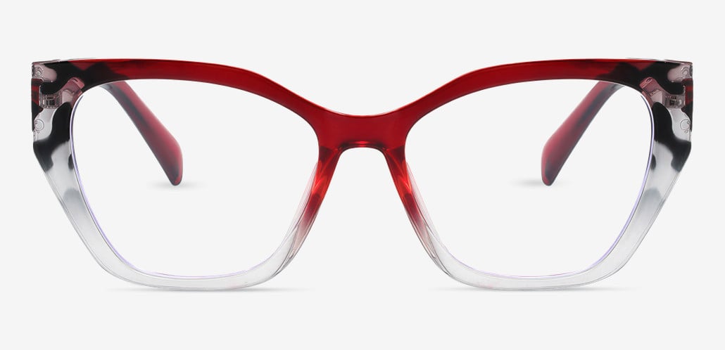
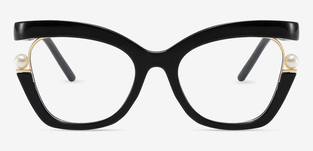
Shape and colour. Last, not because it doesn't matter, but because it's the only constraint with hundreds of valid answers instead of one.
On coatings: an anti-reflective coating is worth the money if you use screens, because reflections off the back surface of a powered lens reduce contrast in a way you stop noticing but don't stop being affected by. A blue-light filter is a smaller and more contested benefit — the evidence for blue light causing eye damage is weak, and the honest case for the filter is glare and contrast comfort for some people, not eye health. Tinted progressive readers are genuinely useful if you read outdoors, and photochromic versions handle both without a second pair.
If you want to see a shortlist against your own face before committing, virtual try-on is more useful here than in most categories — a fair number of people buying their first pair of progressive readers are less worried about optics than about looking like someone who needs them.
The first 72 hours: adaptation, or a spec problem?
"Give it two weeks" is the standard advice and it's half right. Some discomfort genuinely fades. Some of it is a measurement that's wrong and will never improve no matter how patient you are. Running these five checks in the first three days tells you which you're dealing with while the return window is still open.
The static text check. Sit at your normal reading distance and hold a page still. Read a paragraph without moving your head. It should be clear through the lower-centre of the lens. If you have to lift your chin noticeably to find the clear zone, the frame is sitting too low or the fitting height is short. That's geometry, not adaptation, and it won't resolve on its own.
The screen check. Laptop at your usual distance, head level, eyes angled slightly down. Text should be readable in that posture. If you're tipping your head back to bring the screen into focus, either the add is stronger than you need or the corridor is too short to give you a real intermediate zone.
The sweep check. Read across a full-width line of text moving only your eyes. Softening at the far left and right edges is normal and does genuinely fade as you learn to turn your head slightly instead. If the middle third of the line is soft, that's a corridor or height mismatch, and it won't.
The stair check. Hold the handrail for this one. Look down at your feet on a staircase. Because the top of the lens is clear, the ground should look reasonably normal. Significant swim or a sense that the steps are moving means the lens design is producing more peripheral distortion than that frame can accommodate — usually a case for a taller lens with a standard corridor.
The twenty-minute check. Read continuously for twenty minutes and note what happens. Blur that clears when you blink is dryness, not the glasses. Text staying sharp while a dull ache builds behind your eyes points at PD and induced prism rather than power. Text going soft while your eyes feel fine points at power.
The short version of what's worth waiting out and what isn't: edge swim, a mild sense of movement when you turn your head, and having to hunt slightly for the reading zone all fade, typically inside three days to two weeks. A chin-up reading posture, a headache with no blur, and a clear zone that only appears at a distance you don't actually work at do not fade. Those are specification errors, and the correct response is an exchange, not perseverance.

Putting it together
The four numbers depend on each other in a specific order, which is why the sequence matters more than any individual tip.
Your working distances determine the add power. The add power and corridor design together set the minimum lens height you can use. The lens height rules out most frames before style enters the conversation at all. And your PD decides whether all of that lands in front of your pupil or four millimetres to the side of it.
Get those four right and progressive readers stop being a gamble — they become a fairly boring purchase that simply works. Get one wrong, and no amount of care with the other three compensates.
If you're between two powers, take the weaker one. If you're between two frames, take the taller lens. Both errors are recoverable; their opposites usually aren't.
This article covers general guidance for over-the-counter progressive readers. It isn't a substitute for an eye examination. If your vision has changed recently, or you have symptoms beyond difficulty with near focus, see a licensed eye care provider.